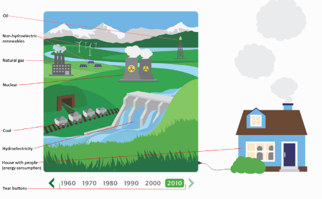
In this newly published open source paper, Robert Newell, Ann Dale and Celia Winters at Royal Roads University in BC investigated the efficiency and effectiveness of interactive data visualisations in the commmunication of building energy production and consumption. Two visualizations were built that held contrasting features: an abstract, static visualization built in the form of a time-series graph and a dynamic, interactive visualization with a ‘picturesque’ design. The results indicate that the interactive visualization held higher potential for drawing in and maintaining audience interests, whereas the static visualization was more useful for users wishing to gain a more detailed understanding of the data. These findings suggest that both types of visualizations have complementary strengths, and collaboration between trans-disciplinary research teams and graphic artists can lead to visualizations that attract diverse audiences and facilitate different information needs and access.
In addition to the most interesting research, the paper itseld includes some interactive PDF features inherently picking up the topic of interactivity in its own presentation.